01 — Context
Part of a bigger bet on loyalty.
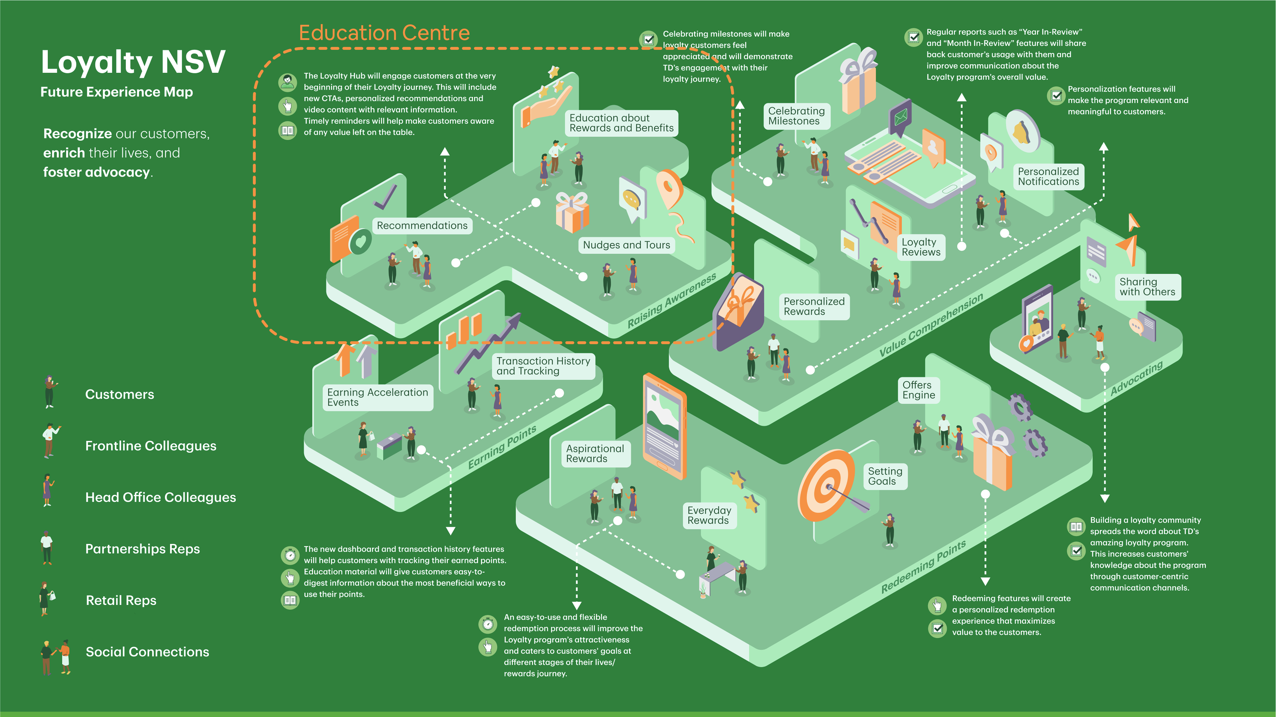
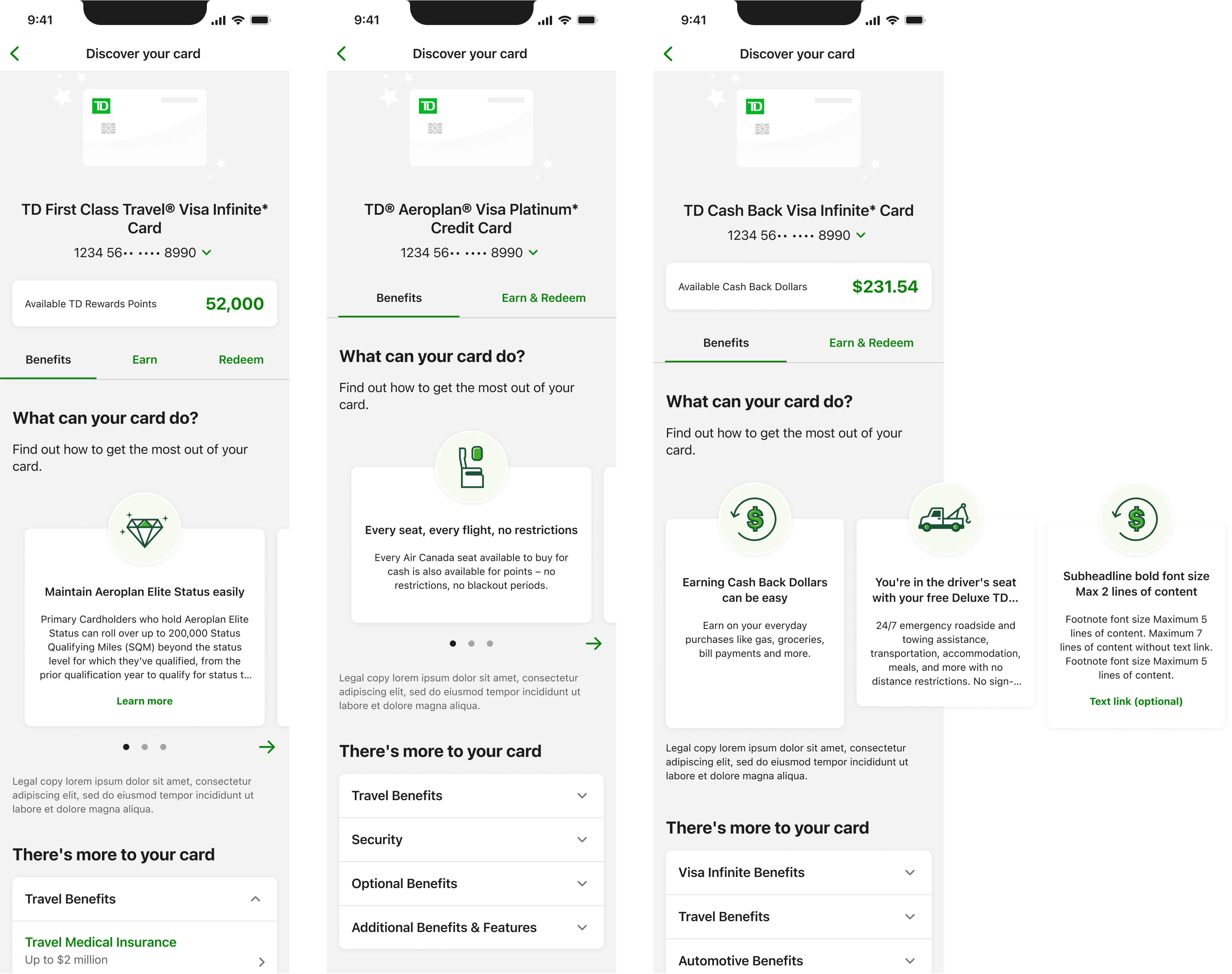
TD's Loyalty & Rewards program spans millions of cardholders across multiple credit card tiers — each with different earning rates, redemption options, and partner integrations. It's a high-value program with significant complexity.
The North Star Vision driving this work was clear: transform users from passive participants into active advocates. The Education Centre was the first step — the foundation that everything else in the loyalty experience would reference.
My role was to take early research and abstract product thinking and translate it into a concrete, production-ready experience. That meant:
- Defining how and where users enter the Education Centre across the app
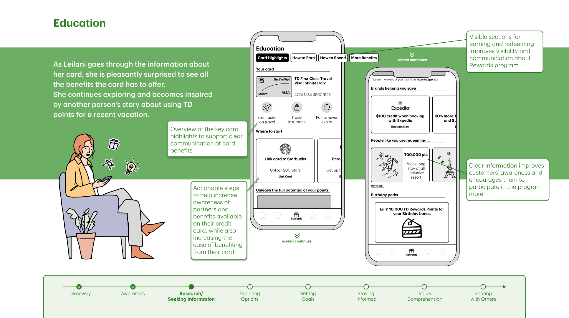
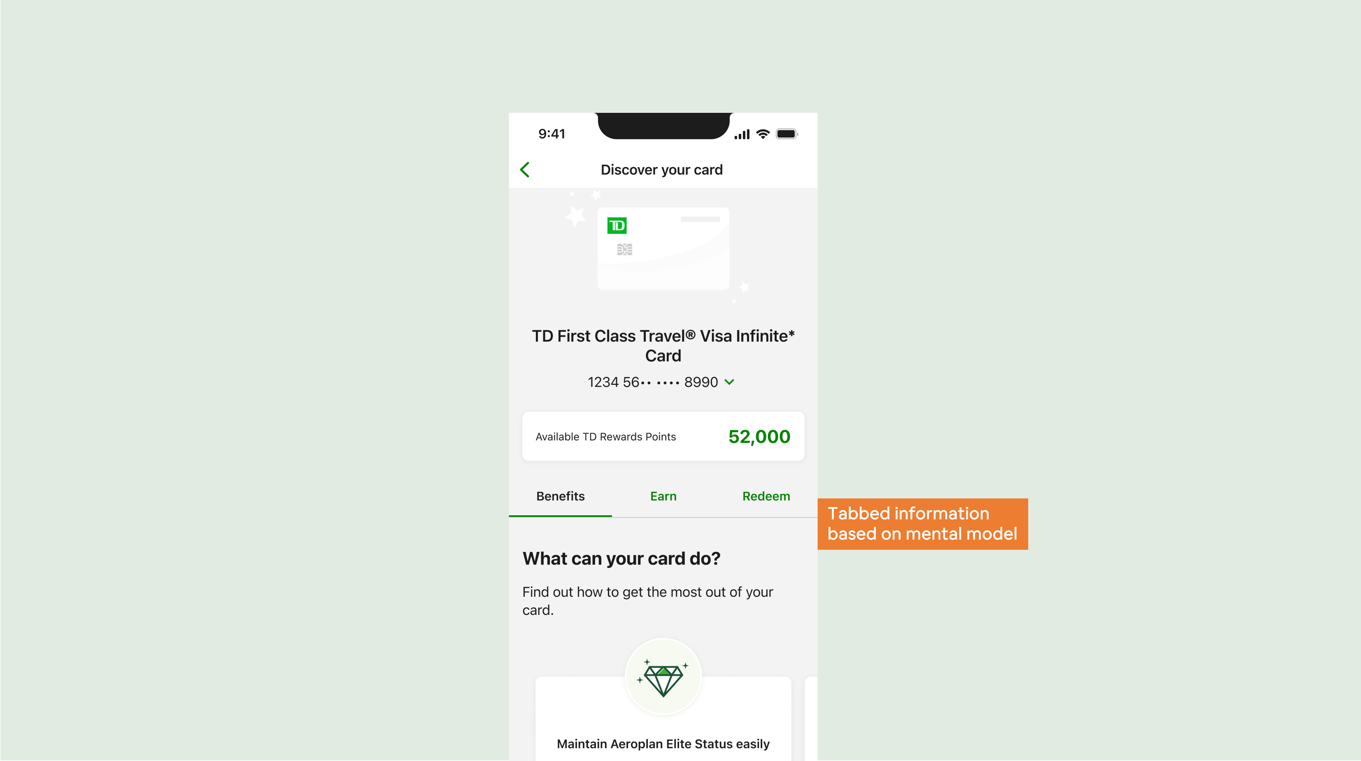
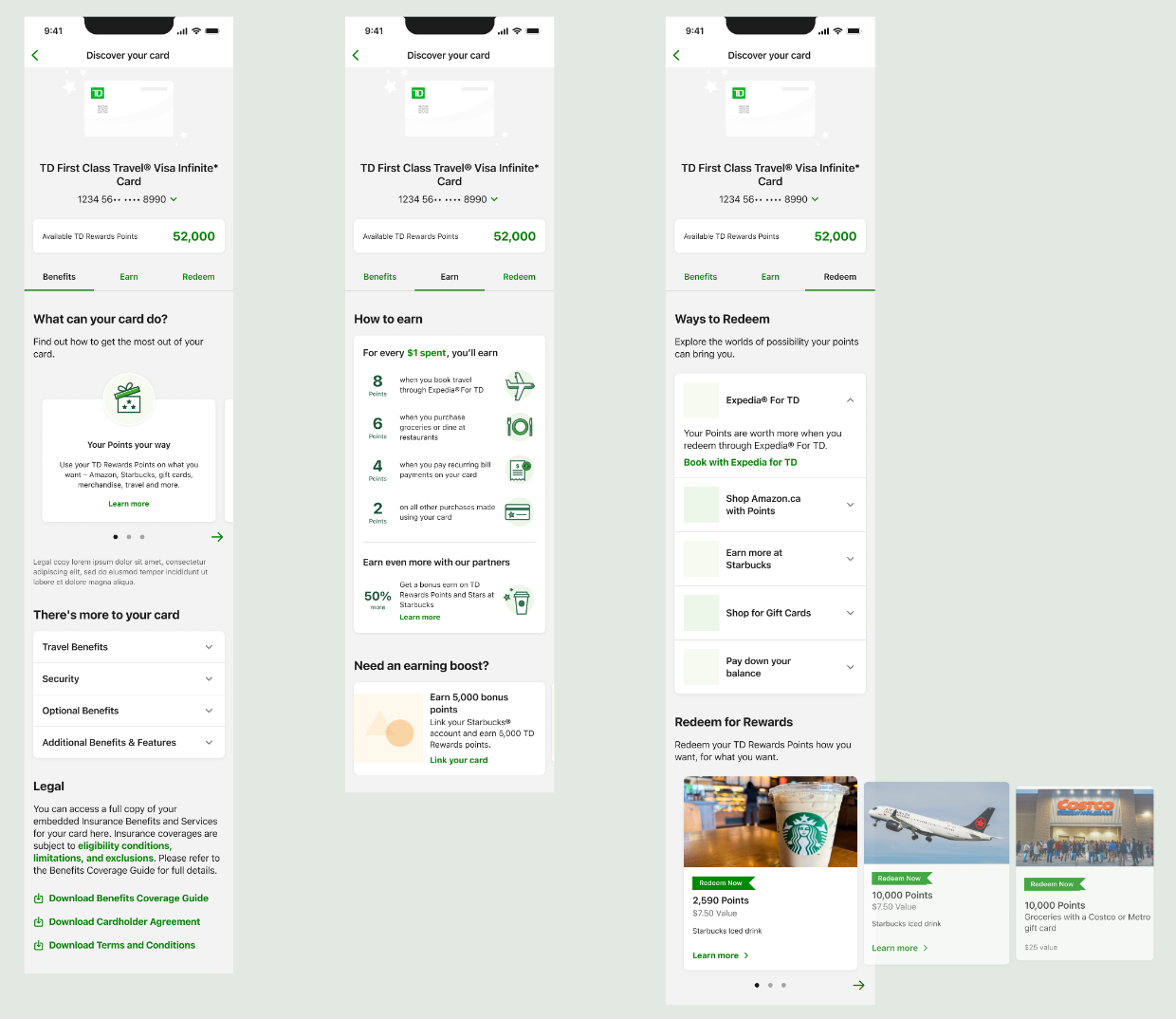
- Structuring the information architecture around user intent, not internal program logic
- Aligning product, engineering, design systems, and legal around a shared IA model
- Designing fallback states and edge cases for multi-API dependencies
- Shipping production-ready specs through design review, QA, and implementation