08 — Sprint → Shipped
The design spec became the build spec.
Documenting every design decision — not just the outcome, but the rationale and the rejected alternatives — meant the implementation had unusually clear requirements to work from. The confidence threshold, the pipeline step names, the per-field flag logic: all of it was written down precisely enough to implement directly.
The gap between prototype and product was narrow by design. When you can explain exactly why a UI behaves the way it does, building it becomes a translation problem rather than a interpretation problem.
Three things held up without change from design to production:
- The confidence-based routing model — no user configuration needed in the live product
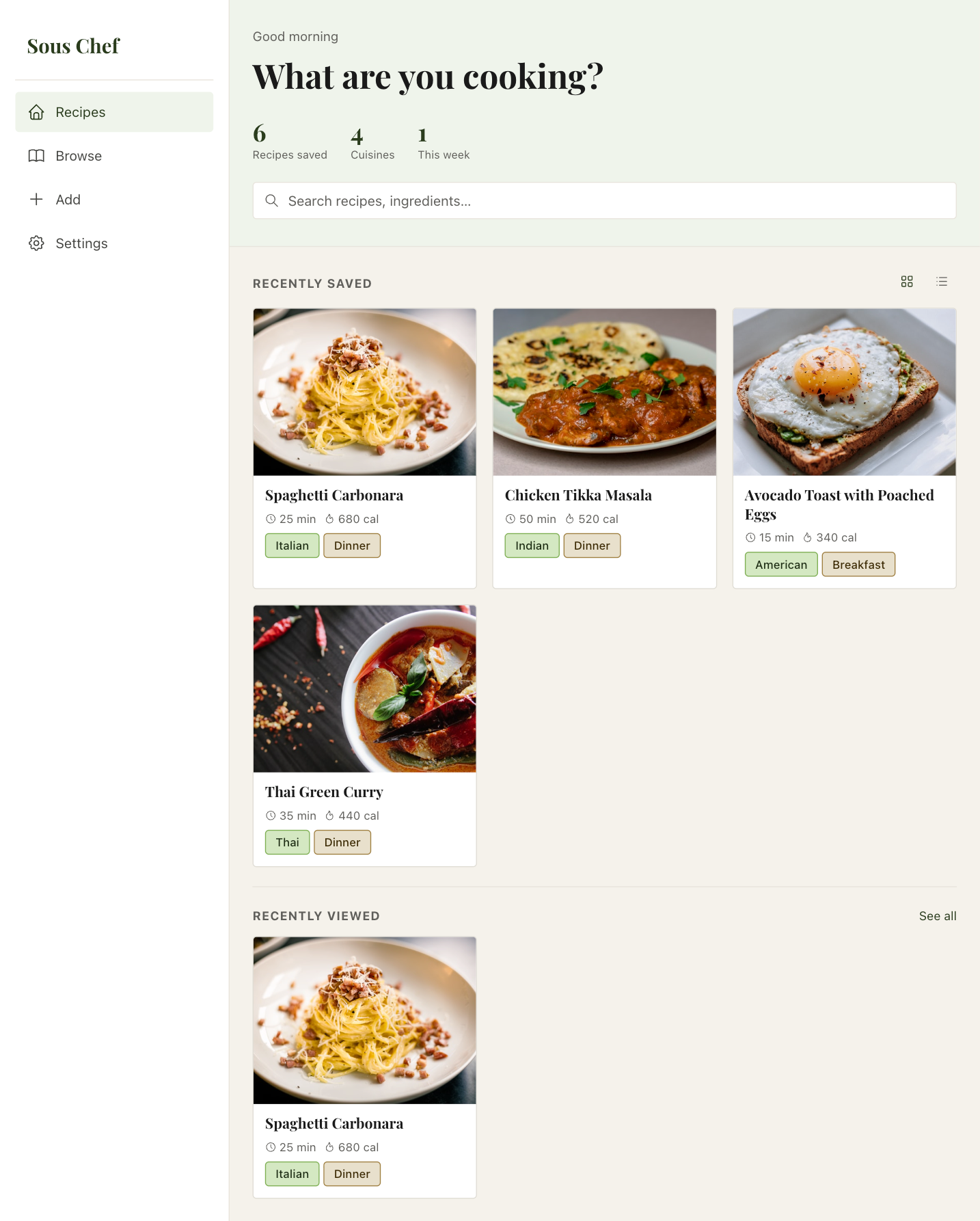
- The named pipeline steps on the saving screen — users respond to seeing the AI's work made legible
- The per-field uncertainty flags — showing only what's wrong, not a global warning
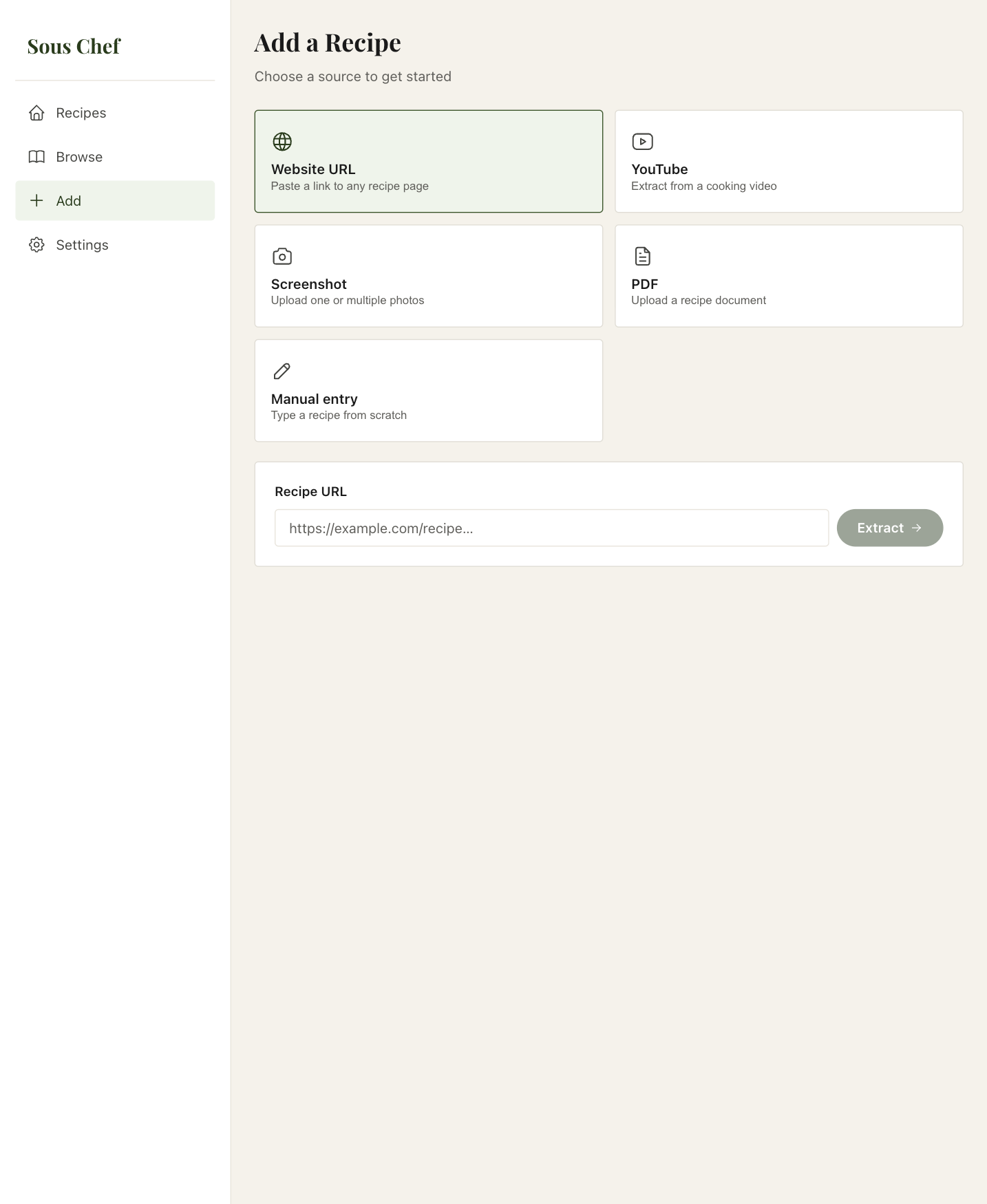
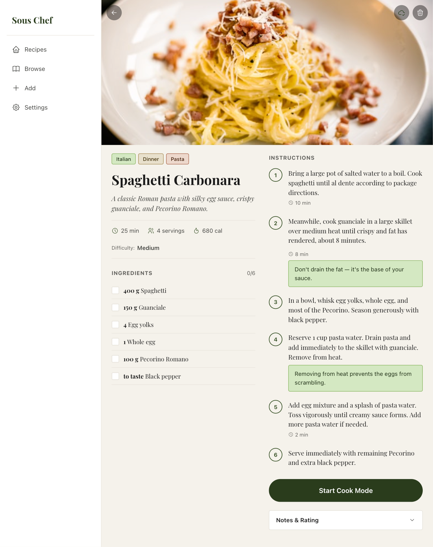
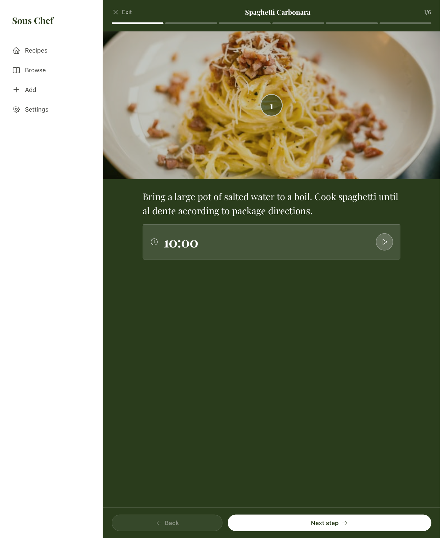
The live app is at souschef-sepia.vercel.app — every screen in this case study corresponds to a live, working feature.