Pacific is a two-sided mental health intake system I designed for Kids Help Phone in 48 hours — a gamified, age-appropriate intake flow for children paired with a real-time counselor dashboard that prioritizes the queue before a session even starts.
Hours from brief to shipped prototype
User types solved for simultaneously
Intake steps designed for ages 0–9
Place — Capital One Kids Help Phone challenge
01 Context
Kids Help Phone is Canada's only 24/7 youth counseling service — free, confidential, and judgment-free. Every interaction happens at a moment of vulnerability: a child who just worked up the courage to reach out.
The Capital One hackathon challenge asked teams to "design a new strategy or method to engage visitors on the website." Most teams read that as marketing or engagement optimization. We read it differently — the biggest drop-off wasn't marketing, it was the moment after someone decided to ask for help.
I joined a team of five: one researcher with a psychology background, and three developers. In 48 hours we had to go from discovery to a working, demo-ready prototype.
Framing the problem
Most hackathon teams optimized for awareness. We questioned why kids were abandoning after already deciding to reach out — and found the intake experience itself was the problem. That reframe is what won.
Team composition
Having a researcher with psychology training wasn't a nice-to-have — it was the structural reason our design was grounded. She knew how children process anxiety and communicate distress in ways I didn't.
02 Problem
The existing experience treated intake like a bureaucratic form — identical for a 7-year-old and a 19-year-old, loaded with questions up front, and completely disconnected from the counselor side. Three friction points kept surfacing.
Child's perspective
The form felt clinical and unwelcoming before a single word of support was offered.
No age differentiation, no warmth, no acknowledgment that the child just took a hard step. The intake was designed for data collection — not for a kid who's scared or upset.
Counselor's perspective
Counselors had no visibility into the queue or caller context until a session started.
Managing multiple waiting sessions with no prioritization tools meant counselors had to triage blind — wasting the first minutes of every session gathering information they could have had before the call.
The core insight
The problem wasn't one-sided. Fixing the child's experience without fixing the counselor's workflow would still result in dropout during wait times. A two-sided solution was the only way to reduce the full funnel of abandonment.
03 Research & Framing
We couldn't do traditional user research in a hackathon — no time for interviews, no access to real callers. What we could do was rapid secondary research, leverage our team's psychology expertise, and interview the Kids Help Phone stakeholders present at the event.
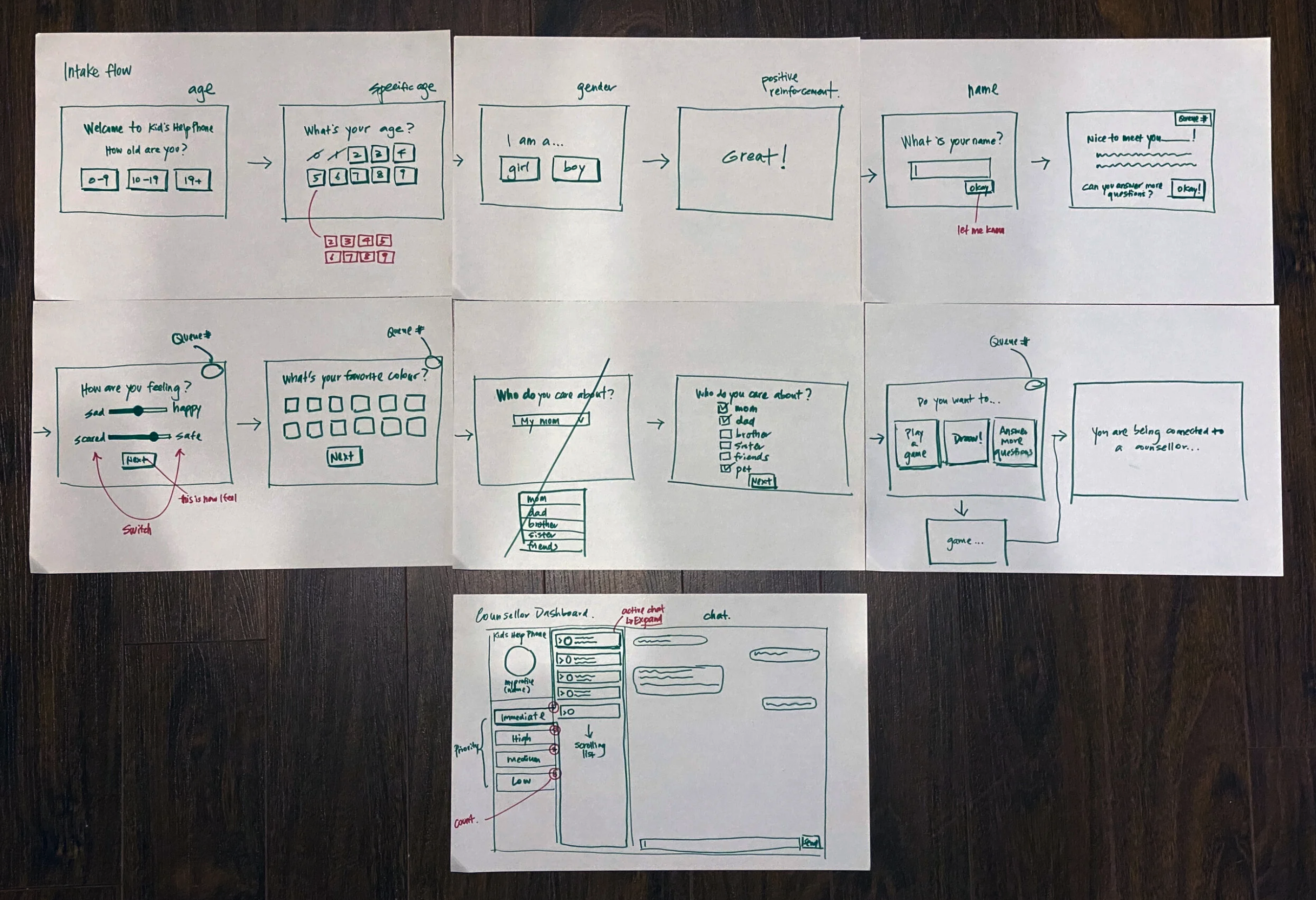
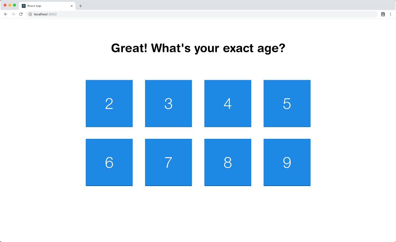
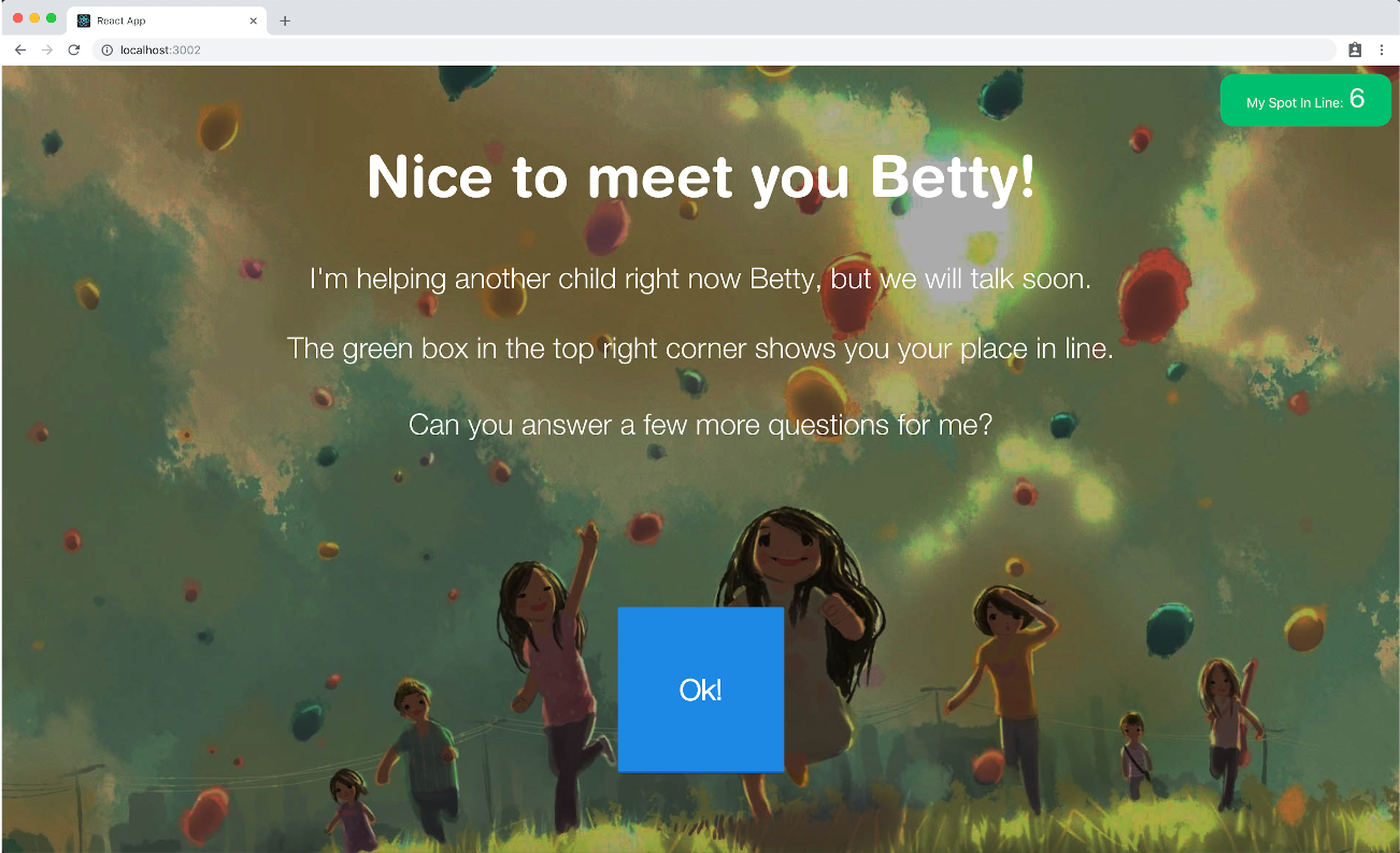
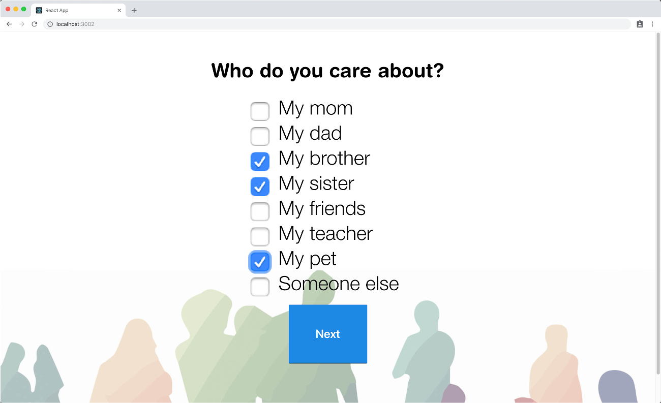
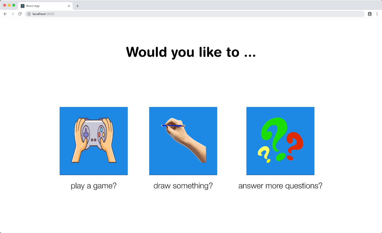
Children abandon intake when they can't predict how long it will take or what comes next.
Design implication: Progressive disclosure and step-by-step framing reduces perceived burden. Each step should feel completable, not infinite.
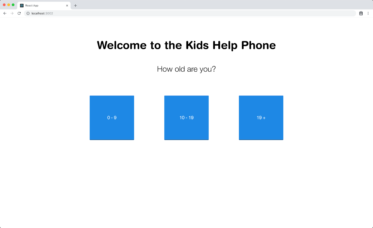
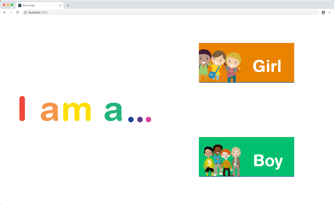
Age-undifferentiated experiences feel alienating — especially to younger children who process forms differently.
Design implication: Age-gating at the entry point lets us match language, iconography, and interaction style to cognitive development stage.
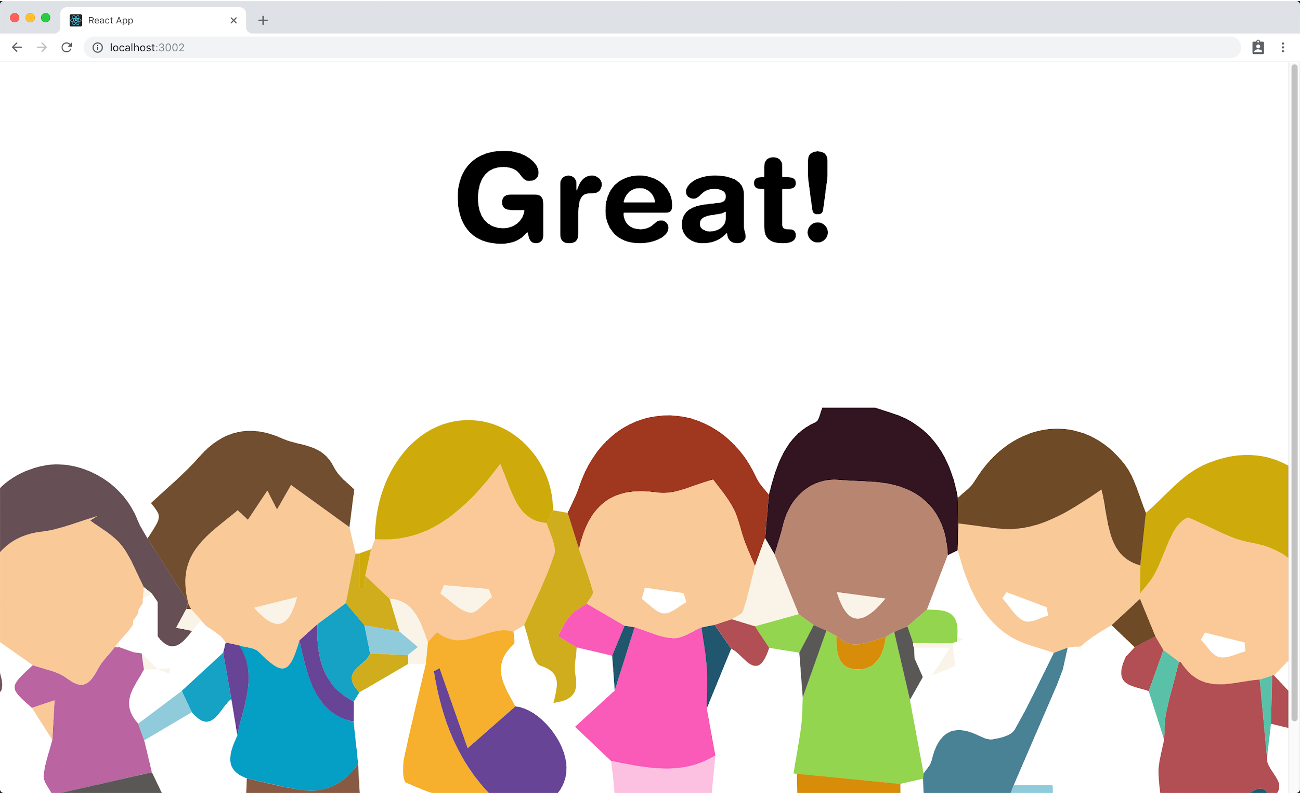
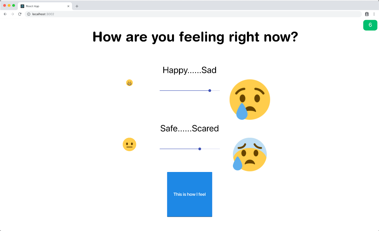
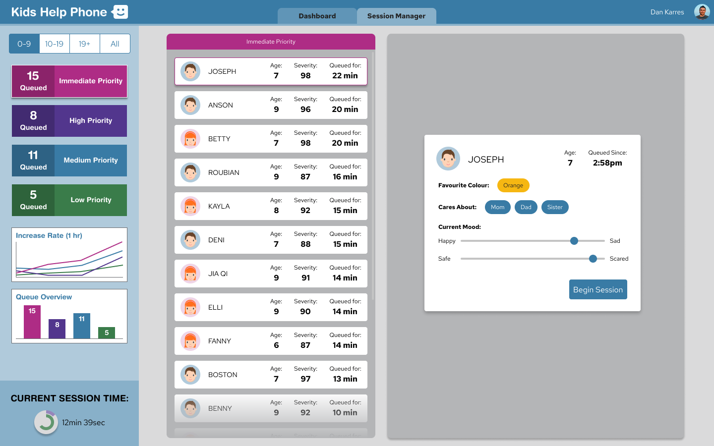
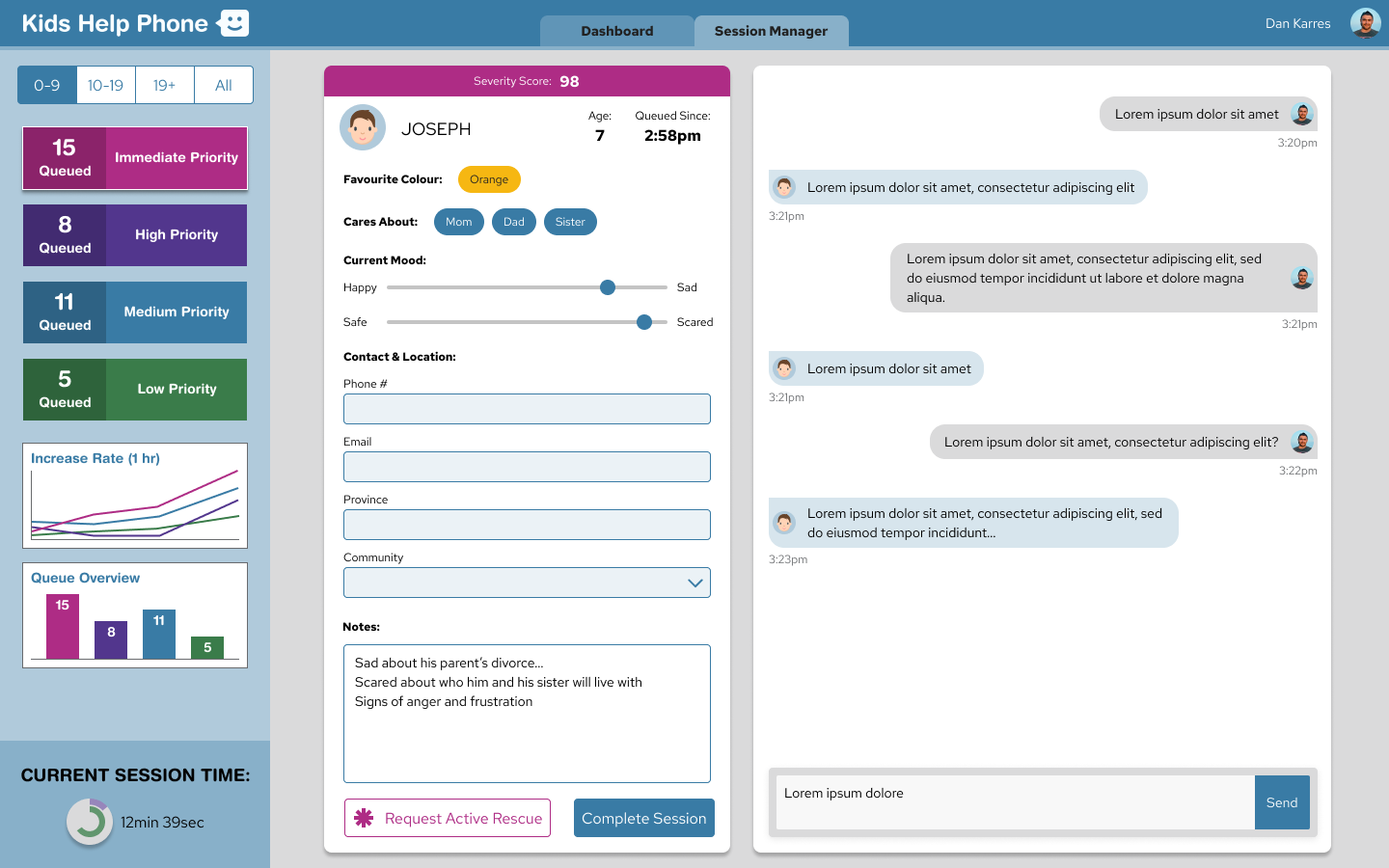
Counselors' effectiveness increases dramatically when they enter a session with context — mood, safety level, age — already surfaced.
Design implication: The intake flow should serve double duty: calming the child and building the counselor's brief before the session begins.
04 Design Decisions
Given the time constraint, we had to make clear calls fast. Each decision was about maximizing impact within 48 hours while building something the Kids Help Phone team could realistically ship.
Gamified, step-by-step intake instead of a form
Rather than presenting intake as a form to fill out, we broke it into 11 discrete steps — each with a single question, large tap targets, friendly iconography, and immediate positive reinforcement after each answer. This shifts the mental model from "filling out paperwork" to "having a conversation." Our psychologist-researcher grounded this in how children under 10 experience anxiety: one manageable step at a time reduces overwhelm significantly.
Age-gating at the first step to fork the experience
The very first screen asks users to select their age group (0–9, 10–19, 19+). This single gate lets everything downstream adapt — language complexity, illustration style, interaction patterns, and the questions asked. For the hackathon MVP, we scoped the full intake build to the 0–9 group (the highest-risk abandonment segment) while scaffolding the architecture to support the other cohorts. Scoping right let us ship something complete rather than three things half-done.
Real-time WebSocket sync between intake and counselor dashboard
As a child moves through intake, their responses populate the counselor dashboard live — severity is calculated automatically (mood + safety scores), the queue reorders by priority, and the counselor can see a child's profile building before the session begins. This required the developers to implement WebSockets, a non-trivial technical lift in 48 hours. The decision was worth it: it's what made the demo compelling and what the Kids Help Phone stakeholders responded to most strongly.
05 Key Screens
The system runs in two environments simultaneously: a mobile-optimized intake experience for the child, and a desktop dashboard for the counselor. Both update in real time via WebSocket.
While the child moves through intake, the counselor's dashboard updates live — severity scores calculate automatically, the queue reorders, and each child's profile is ready before the session begins.
Priority classification
High distress + safety concern signals. Counselor notified to connect immediately regardless of queue order.
Significant emotional distress indicated. Next in queue, no extended wait.
Moderate distress, seeking support. Standard queue position maintained.
Stable mood, looking to talk. May receive async resource suggestions while waiting.
06 Cross-functional Collaboration
Hackathon teams often have a designer hand off visuals to developers and hope for the best. We couldn't afford that — every hour mattered, and the product had to actually work for the demo. That required tight, real-time collaboration from hour one.
Product Design
Alfred (me)
Led product strategy, wireframing, and visual design for both sides of the system. Facilitated the initial problem reframe that shaped the entire direction.
Research & Psychology
Researcher
Grounded the intake design in child psychology — informed question sequencing, emotional language, and why progressive disclosure matters for this age group specifically.
Engineering (×3)
Development Team
Built the React + WebSocket stack from scratch in 48 hours. Collaborated directly with design on feasibility — the real-time sync capability came from a developer suggesting WebSockets during a design critique.
What made the collaboration work
We ran a 30-minute design sprint at the start to align on the problem before anyone opened a design tool or wrote a line of code. That shared understanding meant developers weren't blocked waiting for specs — they understood the "why" well enough to make implementation decisions on their own.
07 Outcomes
At the end of 48 hours, Pacific was a fully interactive prototype with both the intake flow and counselor dashboard running in real time. We presented to a panel of judges including Kids Help Phone stakeholders.
Place — Design Award
Won the Kids Help Phone challenge among all competing teams at the Capital One hackathon.
Sides solved simultaneously
Child intake + counselor prioritization — the two-pronged approach was the differentiating factor according to judges.
From brief to live prototype
Full end-to-end design and implementation with real-time data sync. The prototype ran live during the presentation.
"If we were to deploy this winning solution in the next few months, it would dramatically improve the experience that kids have."
— Ted Kaiser, Kids Help Phone
08 Reflection
Reframing is the highest-leverage design move
Every other team optimized the existing experience. We questioned whether the existing experience was solving the right problem. Spending the first two hours on problem framing — rather than jumping to solutions — is what created space for a genuinely different answer. That habit has stayed with me in every project since.
Cross-disciplinary teams outperform mono-disciplinary ones
A researcher with psychology training fundamentally changed the quality of the design. Without her, we'd have built something visually polished but emotionally wrong. The best design decisions came from the intersection of design craft and domain expertise — not from design craft alone.
Two-sided systems require two-sided thinking from day one
The temptation in a hackathon is to pick one user and nail their experience. We bet on solving both simultaneously — and it was harder, but the system-level coherence is what made the solution compelling. Designing for only one side of a two-sided platform creates the illusion of a solution while leaving half the problem unsolved.
Pacific was an early signal of the kind of designer I wanted to be — one who leads with systems thinking, moves fast without sacrificing rigour, and collaborates closely enough with other disciplines that the final product reflects everyone's expertise, not just the designer's.