On BMO's Personalization team, I used A/B testing and behavioural data to drive measurable conversion gains — including a 57.2% lift on the Auto Loan lead form — and contributed to a full homepage redesign from competitive analysis through to launch.
57%
Conversion lift on Auto Loan lead form across all devices
5
Cross-functional teams aligned on the homepage redesign
7
Design principles distilled from competitive analysis
2
Major projects shipped — form optimisation + homepage
01 — Context
BMO's Personalization team sits at the intersection of design, data, and product. The mandate: reduce attrition, increase conversion, and improve the digital experience using 1st-party behavioural data and rapid A/B experimentation.
Unlike feature teams shipping on quarterly roadmaps, the Personalization team operates in fast cycles — hypothesis, design, test, learn, iterate. A good designer here is comfortable reading test results, updating hypotheses, and treating data as a primary design input.
My role spanned the full experimentation lifecycle. I contributed to shaping what we tested and why — not just executing specs handed down from product:
02 — Project one
01
Site optimisation · A/B test
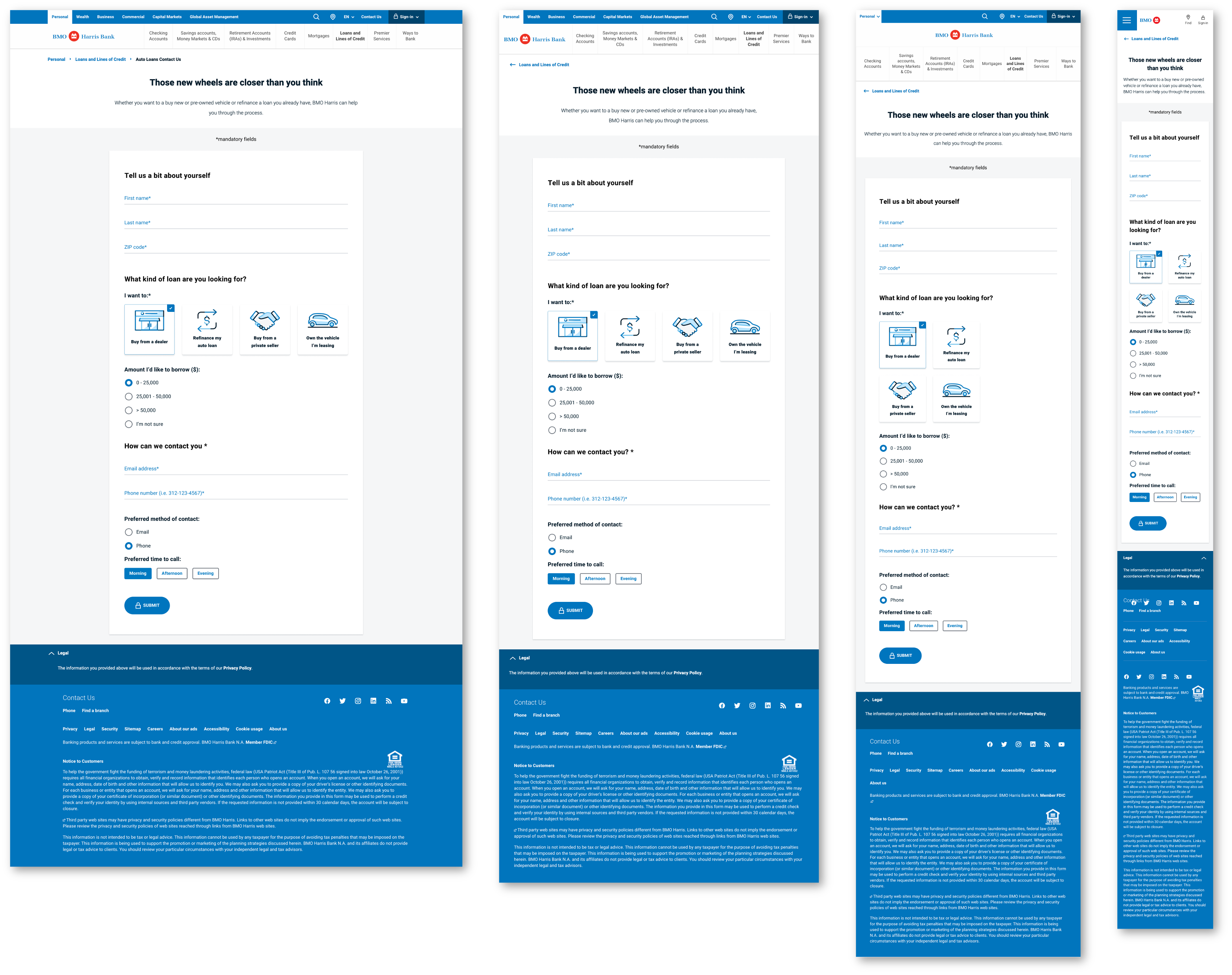
Auto Loan Lead Form Redesign
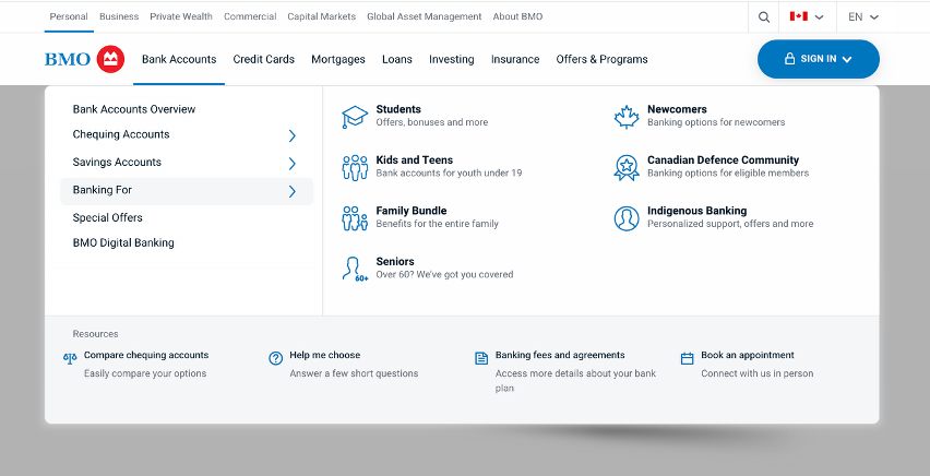
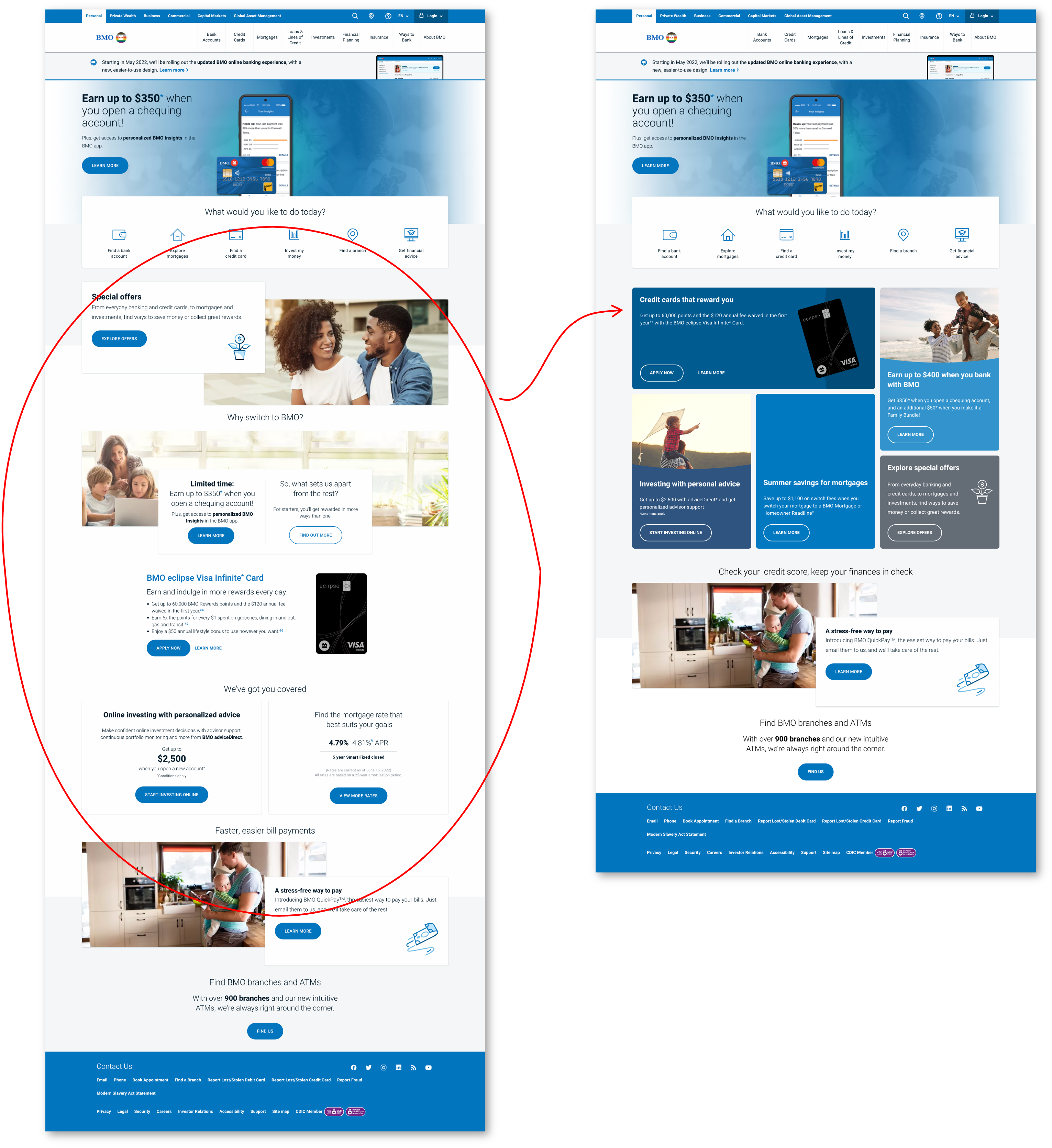
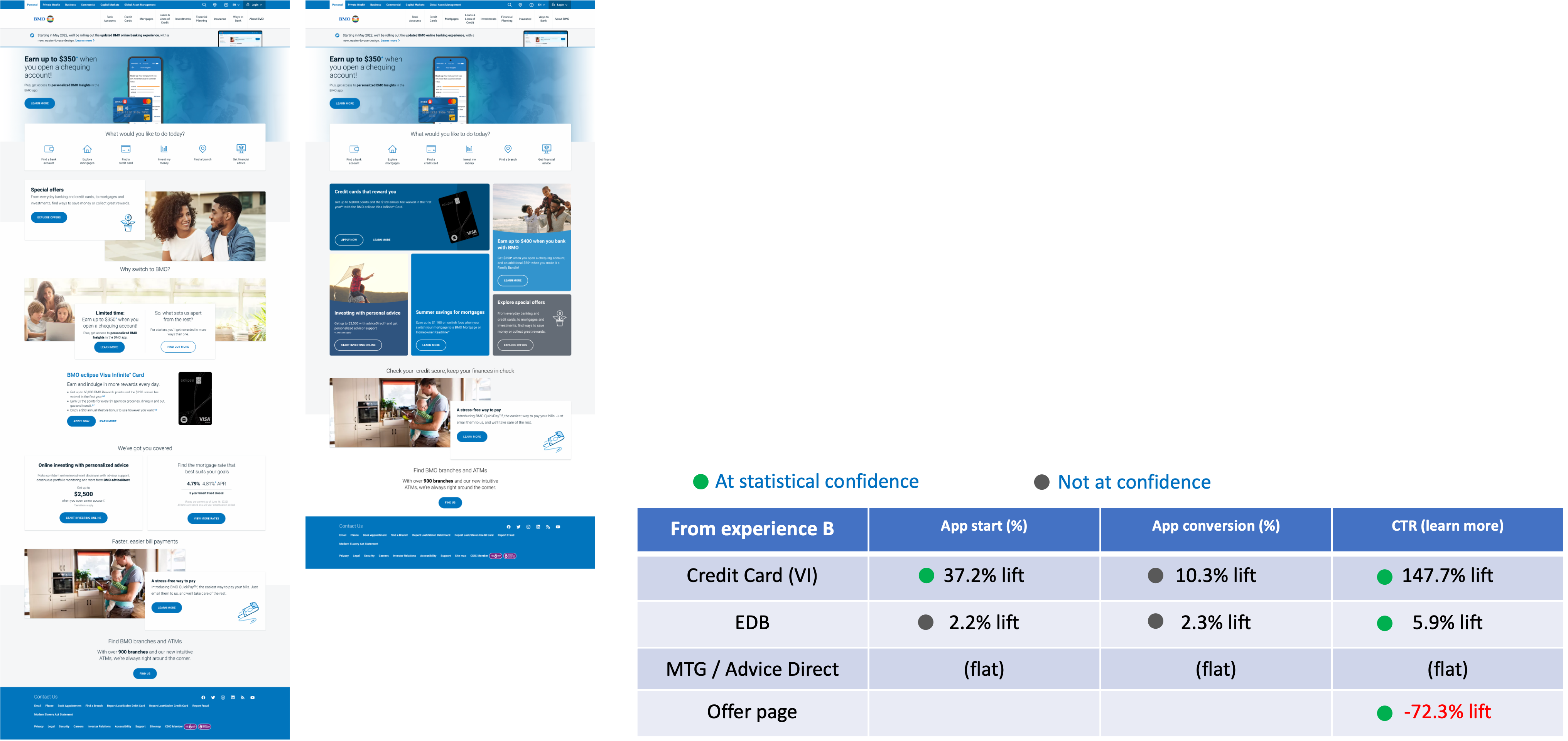
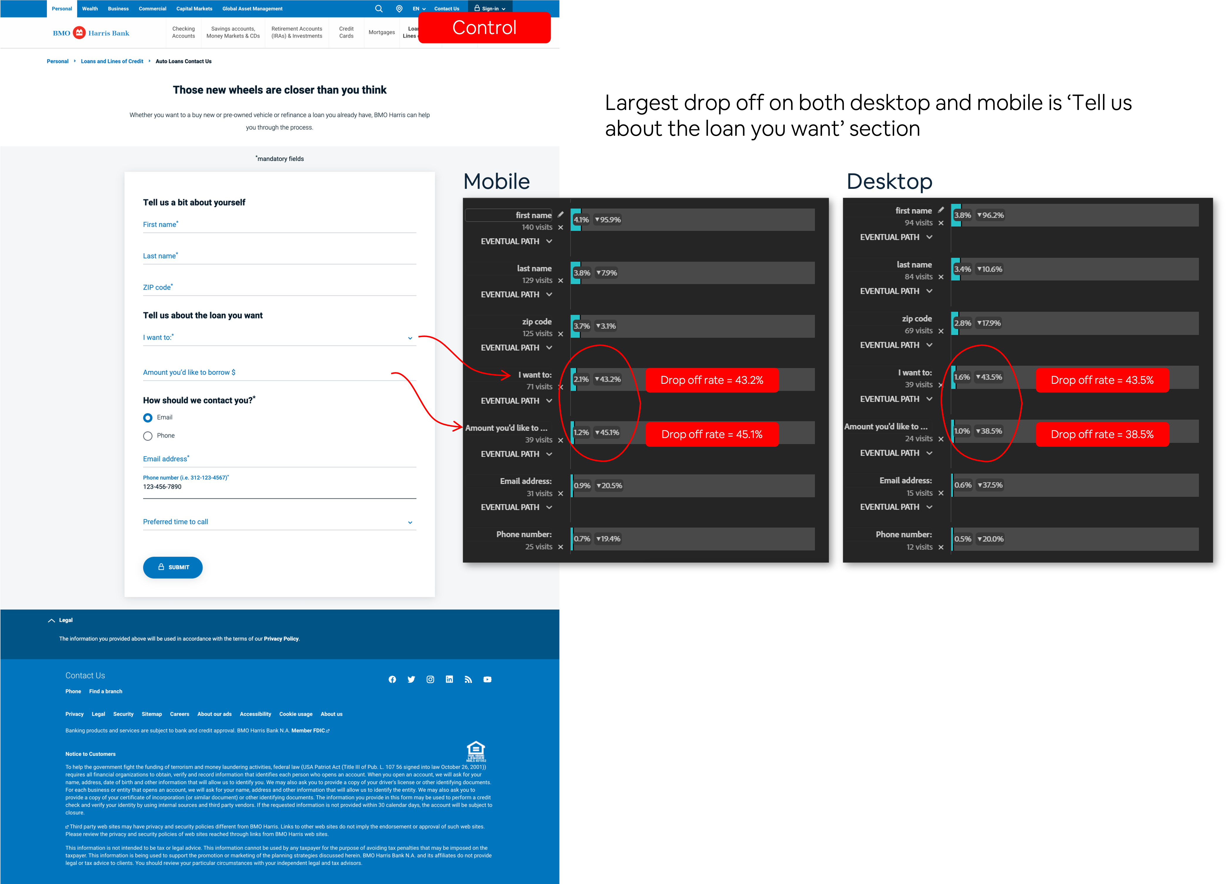
The Auto Loan lead form was a high-stakes page with high abandonment. Customers who reached it were already interested — but the form was losing them before they could complete it. Drop-off data pointed to specific fields where users stalled or abandoned entirely.
The hypothesis: the form's cognitive load was too high. Too many open text fields, no visual hierarchy to guide users through the flow, and a layout that felt equally demanding on desktop and mobile.
"The fields with the highest drop-offs shared a pattern: they required freeform text input where structured input could have done the job better."
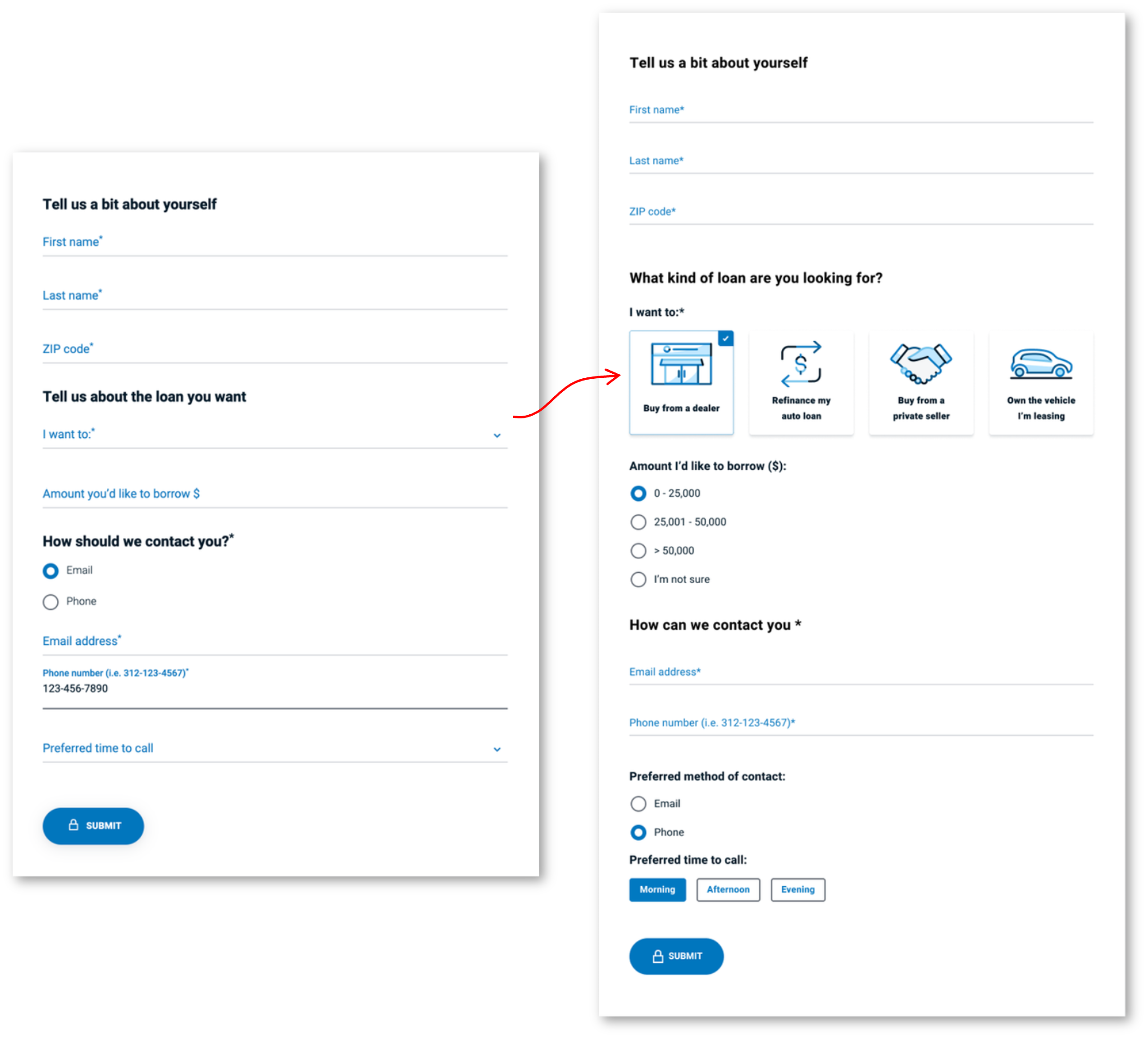
Rather than a full-form overhaul, the redesign targeted friction at its source — the fields with the steepest abandonment curves.
1
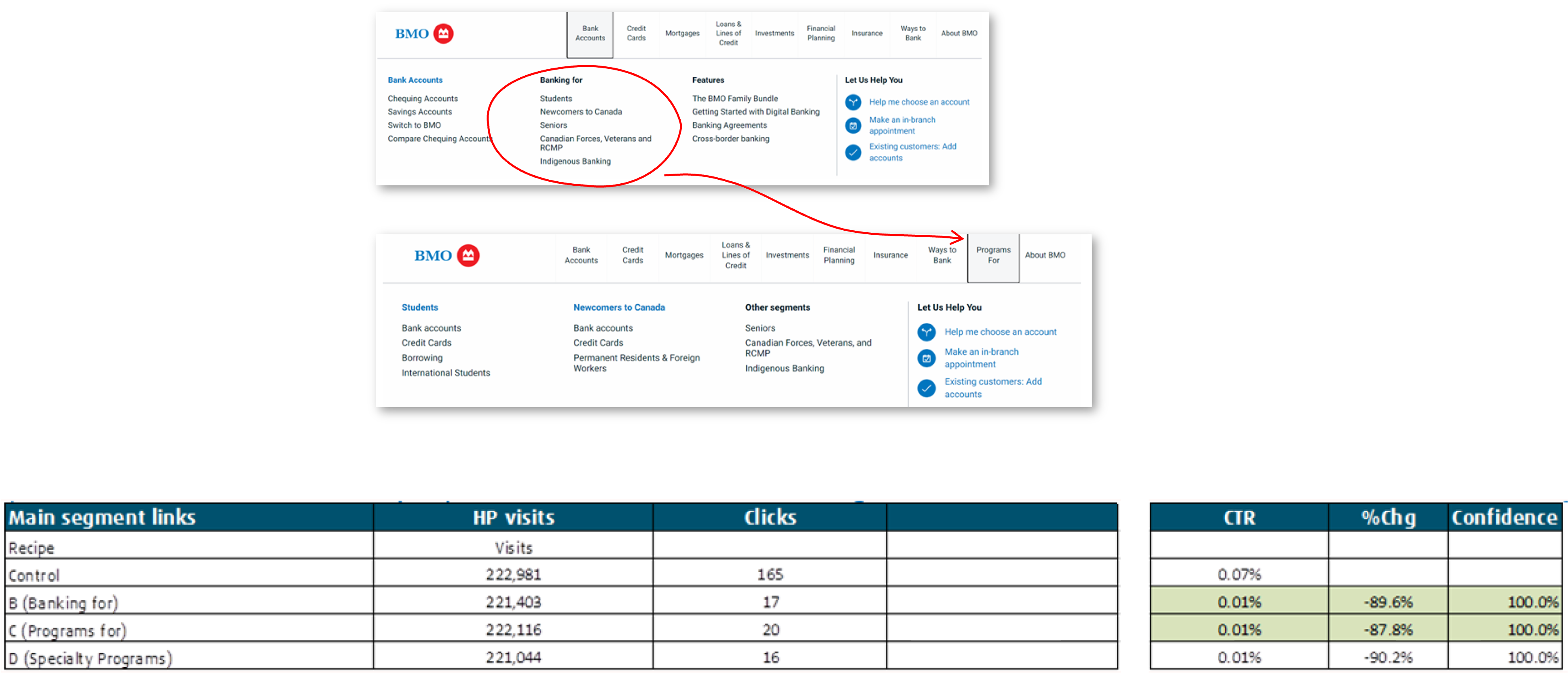
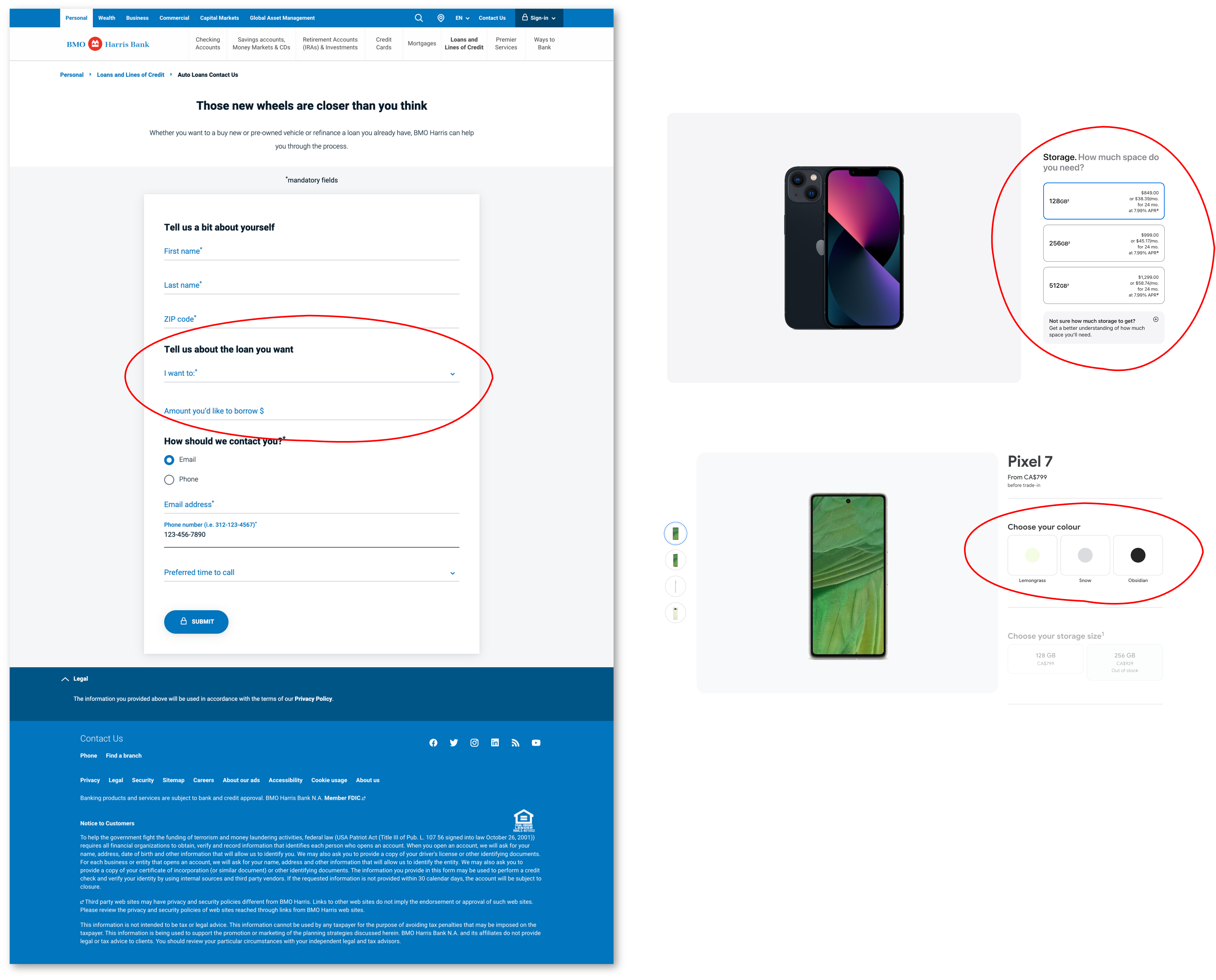
Replace dropdowns with icon-based selectors
Dropdown menus require users to mentally parse a list before selecting. Icon + button UI makes options scannable and tappable — reducing time-on-field and error rate.
2
Restructure for mobile-first completion
Drop-off was disproportionately high on mobile. The redesign prioritised thumb-reach zones and reduced required scrolling to reach the primary CTA.
3
Reduce visual density in key decision fields
Heavy labels and tightly grouped inputs created cognitive overload. Increased white space and simplified labelling reduced the perceived effort of completing the form.
57.2%
Key learning
Reducing input type is as valuable as reducing input count. We didn't remove fields — we changed how users interacted with them. Switching from freeform text to structured selection reduced the perceived cost of each field without changing what we collected.
03 — Project two
02
End-to-end redesign · Research → Launch
BMO Homepage Redesign
BMO's homepage served as a catch-all for every product, promotion, and business unit that wanted visibility. The result was a page that worked for the organization's internal priorities, not for the people visiting it.
The redesign was a full-cycle project involving five teams and every phase of the design process: competitive analysis, moderated user research, ideation and workshopping, pre-launch A/B testing, and a phased rollout.
04 — Research
The redesign was grounded in both quantitative behavioural data and qualitative user research — run in parallel so each could validate the other before any design decisions were made.
Competitive analysis reviewed traditional financial institutions, fintechs, and indirect competitors against a structured grading system covering branding, innovation, navigation, technical quality, and accessibility. Designers, stakeholders, and agile team members were brought into workshops to score and discuss findings.
User research was conducted with BMO's dedicated research team and included synthesis of prior research, heuristic review, internal stakeholder interviews, and moderated usability testing — both on competitor sites and on bmo.com.
7 design principles from competitive analysis
01
Use contrast and colour to place deliberate focus on CTAs
02
Tailor messages to the user — not the product catalogue
03
White space increases comprehension and reduces fatigue
04
Sticky navigation allows for 22% quicker wayfinding
05
Navigation structured around user needs, not org structure
06
First impressions drive trust — the hero sets the tone for everything below
07
Iconography as visible language — reduces cognitive load without removing information
05 — Insights
Qualitative user research surfaced three consistent pain points that shaped the redesign's core priorities — not just what to change, but why and in what order.
01
The homepage was product-centric, not user-centric — listing everything without considering why someone had arrived.
Implication: Reorganize around user intent. The page needed to answer "what are you here for?" before trying to sell anything.
02
Visual and performance inconsistency eroded trust and made the page feel unpolished despite the brand's scale.
Implication: Enforce design system consistency. Not just component-level polish — systemic coherence across the entire page.
03
The page was too long. Users didn't scroll — they bounced. Components below the fold had near-zero engagement.
Implication: Reduce page length through a modular layout that groups content, makes scanning easy, and eliminates dead-weight sections.
06 — Design decisions
The new UI was visually simpler — better contrast, micro-interactions, animation, and white space. But the changes that mattered most were structural: a rebuilt IA and a new modular layout system.
01
Simplified, needs-based IA
The original IA reflected BMO's internal product taxonomy — good for org charts, confusing for customers. The redesign rebuilt navigation around how users actually think: find a product first, then explore from there. A/B testing confirmed the direction: users with the new navigation adopted a needs-based exploration pattern, starting with their target product category, then moving outward. Segment links placed beneath product labels generated the highest engagement across all nav variants tested.
02
New modular layout system
A new modular layout grouped related product offers and points of interest into coherent sections — replacing a single-column list of components. This made the page shorter, more cohesive, and easier to scan. The modular component was new to the design system, requiring close collaboration with the DS team to build it as a reusable, extensible pattern — not a one-off. The homepage redesign contributed to the system rather than forking from it.
07 — Pre-launch testing
Before the new homepage rolled out, both the modular layout and updated navigation were A/B tested on the existing homepage. This generated quantitative data on real user behaviour, reducing launch risk and sharpening the final design.
The results didn't just validate direction — they surfaced a specific, actionable finding about content position that directly changed how the final design was sequenced.
Baseline engagement. No position-based differentiation.
Significant lift for top-position product pages. Special Offers saw reduced click-through after moving to a lower grid position.
Key learning — position matters as much as content
Top elements in the module received substantially more engagement than bottom elements. This wasn't just confirmation that the modular layout worked — it was a signal to be deliberate about sequencing. Special Offers performed well at high placement; moving them down reduced engagement regardless of visual treatment. The final design reflected this directly: high-priority products and CTAs were placed at the top of the module hierarchy.
08 — Collaboration
A homepage redesign at a major bank touches more teams than a typical product feature. Each brought constraints that shaped the final design — and aligning them without losing design integrity was part of the work.
Holding the design direction steady while incorporating feedback from five different stakeholder groups — and still shipping on time — is the kind of cross-functional coordination that doesn't show up in a prototype but is felt across every phase of delivery.
Product team
Collaborated on scoping the redesign phases and aligning the roadmap. The February 2023 launch followed a controlled October 2022 A/B rollout — a sequencing decision made jointly with product to manage risk and generate pre-launch learnings.
Research team
Worked with BMO's dedicated user research team to design the research plan and synthesize findings. The three core pain points that drove the redesign emerged from this collaboration — not from assumptions or competitive benchmarking alone.
Design Systems team
The modular layout was new to the system. Rather than building it as a one-off homepage component, I worked with the DS team to define it as a reusable, documented pattern — ensuring the homepage investment contributed to the system and remained available for use across bmo.com.
Junior Designer · Content Writer
Acted as de facto design lead for a junior designer and content writer on the personalization pod — running crits, giving feasibility direction, and shaping copy strategy. The junior designer's work required fewer revision cycles due to earlier technical alignment; the content writer's copy tested stronger in A/B variants where I'd provided guidance on message hierarchy and clarity.
CMS team
The new modular structure required CMS architecture changes to support flexible content slotting. I worked with the CMS team to define the content model so design flexibility didn't create authoring complexity — a constraint that shaped several layout decisions.
09 — Outcomes
The most visible outcome was the 57.2% conversion lift on the Auto Loan form — a concrete, at-confidence result that directly influenced the Personalization team's subsequent test priorities.
The homepage redesign's impact is structural: a cleaner IA that reflects how users actually navigate, a modular layout system that's now part of the design system, and a validated methodology for testing before shipping at scale.
57.2%
Conversion lift
At statistical confidence across all devices on the Auto Loan lead form — one of the highest-performing tests that quarter.
1
New design system component
The modular layout built for the homepage was contributed to the design system as a reusable, documented pattern available across bmo.com.
Feb '23
Homepage shipped
Full homepage launched after a phased A/B rollout, with navigation and layout validated by real user behaviour before going live.
10 — Reflection
The competitive analysis was thorough but primarily a benchmark exercise — evaluating what others had done rather than stress-testing our own assumptions. In retrospect, I'd push for lightweight generative research with BMO users earlier in the process, before the competitive audit, so we were grounding competitor observations in actual user behaviour rather than the other way around.
I'd also advocate for a longer A/B testing window on the module test. The results were significant, but a longer run would have given more confidence on lower-traffic segments — particularly mobile users in smaller markets.
Growth design teaches you to hold two things at once: conviction about the problem, and humility about the solution. You can be confident in your hypothesis and still get surprised by the data. The best test results weren't the ones that confirmed what we designed — they were the ones that told us something we didn't expect.
The position-matters finding from the module test is a good example. We didn't design to test that; we discovered it because we were reading the data carefully. That kind of accidental learning only happens when the team treats A/B tests as genuine experiments, not just validation exercises.