← All work
UX/UI Designer BGIS · 2021 WCAG 2.1

Designing for the employees
everyone else forgot.

BGIS's internal employee portal — Intrazone — hadn't been updated in years. It was inaccessible, non-responsive, and visually outdated. I redesigned it from the ground up: modern UI, WCAG 2.1 compliant, and responsive across desktop, tablet, and mobile. The result was received so well the business commissioned the same approach across its other internal sites.

Role

UX/UI Designer

Company

BGIS

Platform

Web · SharePoint

Year

2021

Standard

WCAG 2.1 AA

AA

WCAG 2.1 compliance achieved — including high contrast mode

3

Platforms fully supported — desktop, tablet, and mobile

2

Languages supported without simultaneous display issues

+

Approach extended to additional BGIS internal sites after launch

01 — Context

Enterprise internal tools are often the last to get design attention.

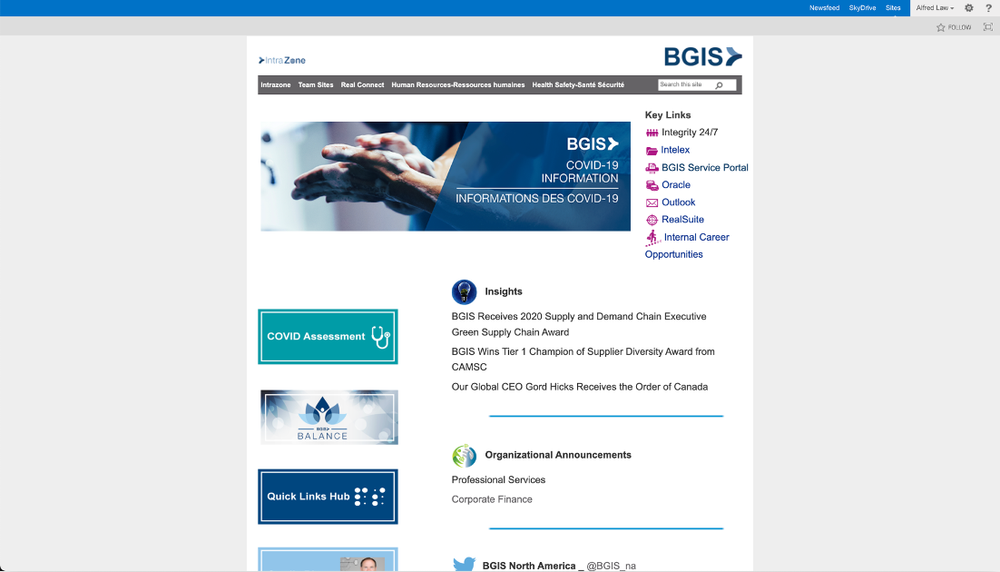
Intrazone is BGIS's employee homepage — the central hub linking to administrative tasks, training resources, employee health information, and team SharePoint pages. Every BGIS employee uses it. None of them had any say in how it looked or worked.

Internal tools tend to get deprioritised because they don't generate revenue directly. But they affect everyone who generates that revenue. A poorly designed employee portal creates friction every single day — for every single person who uses it.

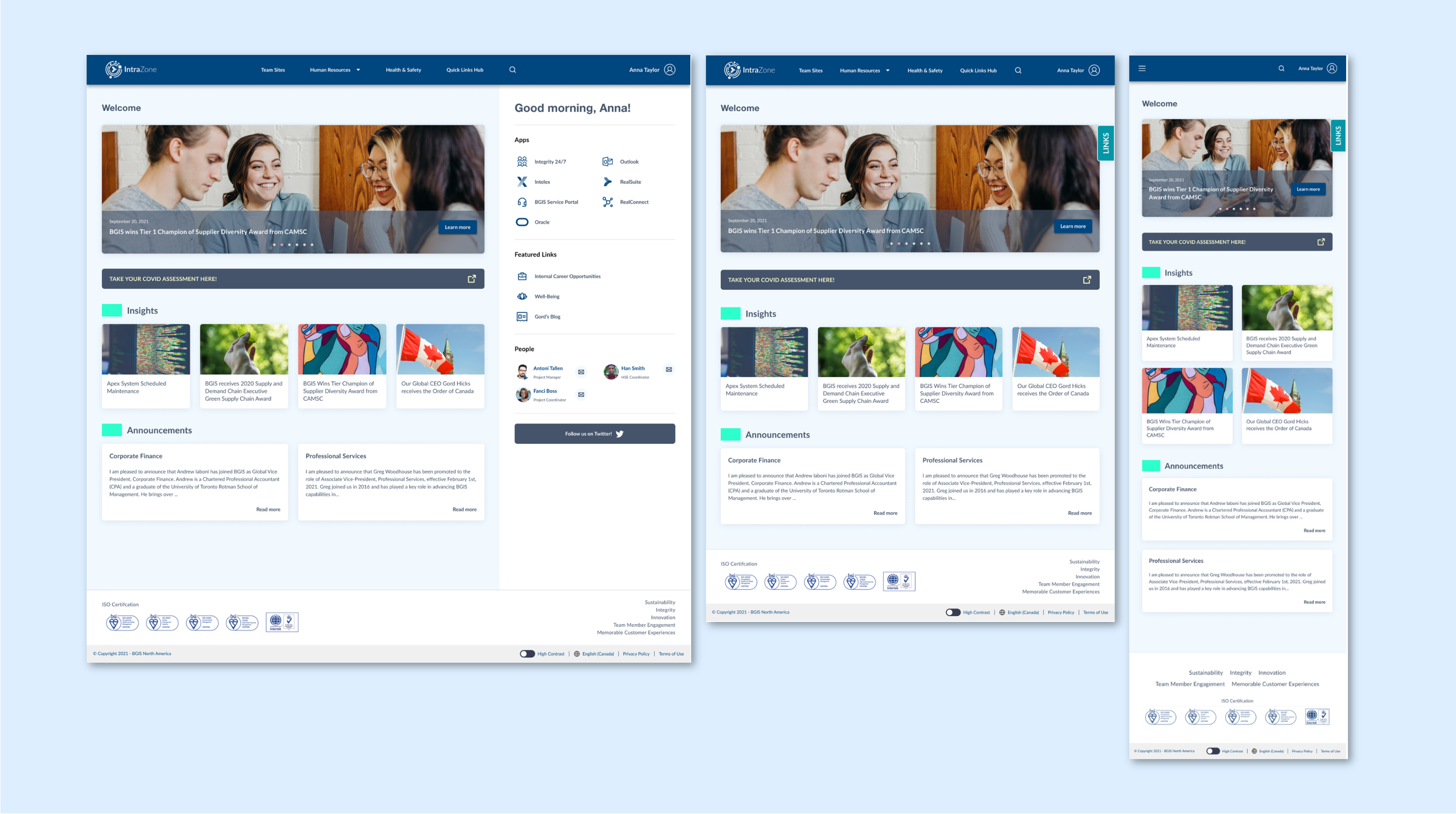
By 2021, Intrazone was showing its age in ways that went beyond aesthetics. The site hadn't been meaningfully updated in years. New accessibility legislation and WCAG standards had raised the bar. The adoption of a new BGIS brand required a visual refresh. And the shift toward hybrid and remote work had created new demand for mobile and tablet access that the site simply didn't support.

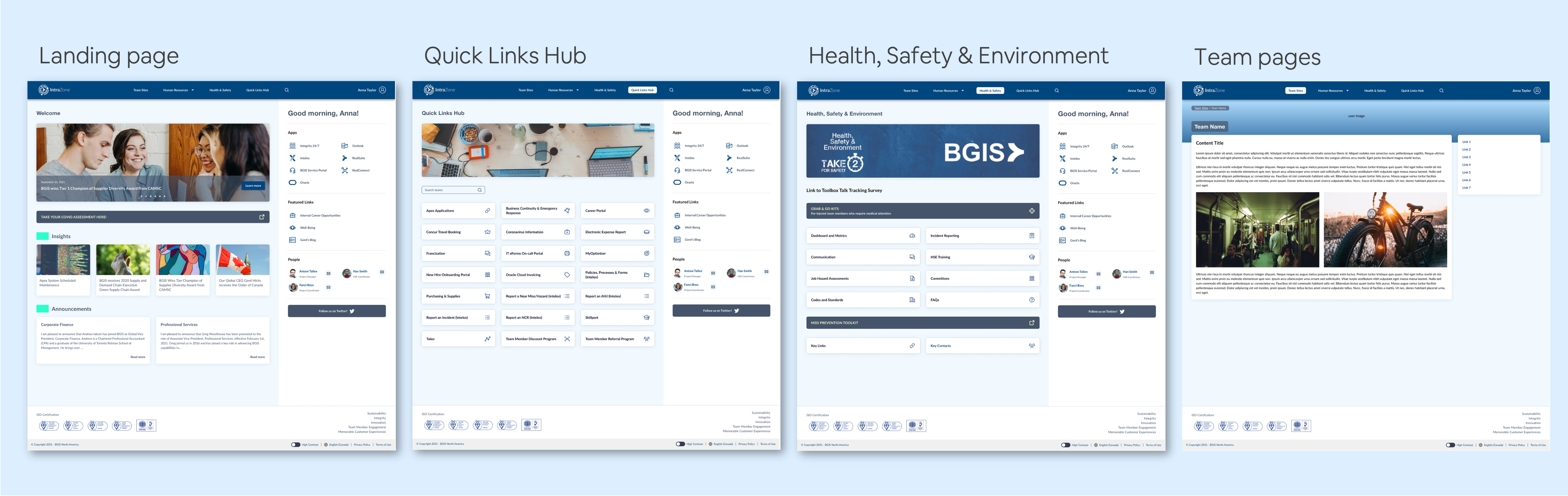
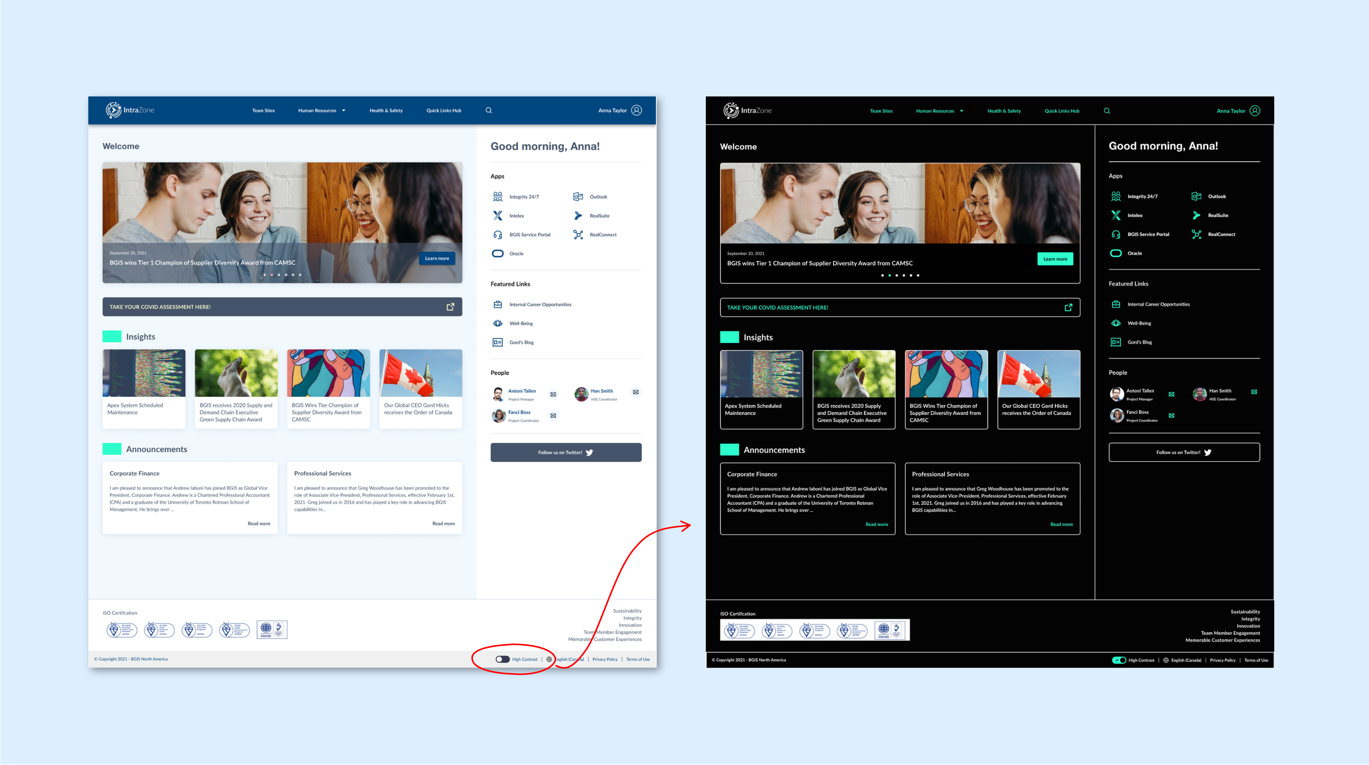
The mandate was clear: modernise the look and feel, bring the site to WCAG 2.1 AA compliance, and make it fully responsive — without breaking the content workflows that administrators relied on to maintain it.

BGIS old Intrazone

02 — Existing site audit

Four compounding problems — each making the others worse.

The existing site wasn't just outdated — it had structural problems that actively worked against usability and compliance. Each issue independently warranted a fix; together they made a strong case for a ground-up redesign rather than incremental patching.

An audit of the existing site mapped four distinct problem categories. Fixing them required coordinated design decisions — resolving one in isolation would have created new problems elsewhere.

Existing site Before
Text embedded in images — not readable by screen readers or search
English and French content displayed simultaneously with no language switching
No responsive layout — desktop-only, broken on mobile and tablet
Outdated brand colours no longer aligned with BGIS identity
No high contrast mode — colour contrast ratios below WCAG minimums
Links scattered across the page with no consistent navigation pattern
Redesign After
All text in live HTML — accessible to screen readers and indexable
Language toggle — single language displayed at a time
Fully responsive across desktop, tablet, and mobile breakpoints
Updated to new BGIS brand colours with consistent application
High contrast mode toggle meeting WCAG 2.1 AA requirements
Persistent links hub — consistent location on every page

03 — Design decisions

Three decisions that shaped the whole system.

Each design decision was driven by a specific problem from the audit and had implications across the whole design — not just the surface it addressed directly.

01

Persistent links hub

✦ Fixed right-column sidebar on all pages

The most-accessed links on Intrazone were buried inconsistently across different pages. Users had to remember where things lived rather than develop a predictable mental model. The redesign anchors a links hub to the right-hand side of every page — persistent across navigation, always in the same place regardless of content.

Persistent links hub

Why right column: The main content area needed to remain the focal point. Placing the links hub on the right preserves left-to-right reading flow while ensuring utility links are always within a short eye movement. On mobile and tablet, the sidebar collapses behind a persistent floating button — maintaining access without competing with the primary content.

02

High contrast mode toggle

✦ User-triggered accessibility mode

WCAG 2.1 AA requires a minimum contrast ratio of 4.5:1 for normal text. The existing site's colour palette failed this threshold in multiple places. Rather than simply selecting compliant colours for the default theme and calling it done, the redesign introduced a high contrast mode toggle — giving users with visual impairments the option to activate significantly enhanced contrast at any time.

High contrast mode toggle

Why a toggle vs. system preference detection: Enterprise environments often have managed system settings that don't reflect individual employee preferences. A user-controlled toggle inside the portal ensures the option is always available regardless of what the operating system reports. It also makes the accessibility commitment visible — a signal that the organisation takes it seriously.

03

Modular, maintainable layout

✦ Defined sections with minimal admin overhead

A redesign that administrators couldn't maintain would revert to the old site within months. The layout was structured around well-defined, modular sections — each independently updatable without touching the others. This reduced maintenance effort significantly and ensured the redesign would stay current rather than accumulate debt.

Constraint acknowledged: SharePoint imposes real constraints on layout flexibility. The design was scoped to what the CMS could reliably support — not what was theoretically ideal. This required early conversations about what was buildable before committing to layouts in the design phase.

04 — Responsive design

The same experience — adapted for where people actually are.

With hybrid and remote work accelerating in 2021, employees were no longer guaranteed to be at a desktop when they needed to access Intrazone. A site that only worked at a desk wasn't a site that worked for its users.

Three distinct breakpoints — desktop, tablet, and mobile — each with intentional layout decisions rather than simple content stacking. The goal was to feel native to the device, not just technically functional on it.

Responsive design across breakpoints

Desktop

Full two-column layout. Links hub always visible in right sidebar.

Tablet

Grid layout. Links hub collapses into a persistent bottom button.

Mobile

Stacked list layout. Hamburger nav + floating Links button in header.

05 — Accessibility

WCAG 2.1 AA isn't a checkbox. It's a minimum.

Accessibility compliance for internal tools is often treated as a legal formality — something to check off before launch and then forget. This project treated it as a design constraint that improved the experience for everyone, not just users with disabilities.

The existing site had multiple WCAG failures — most significantly, embedding text inside images, which made content invisible to screen readers and impossible to resize. Every failure was addressed systematically, not just the ones most likely to be audited.

1.4

Distinguishable — Contrast

All text in the default theme meets the 4.5:1 minimum contrast ratio. High contrast mode significantly exceeds this threshold, targeting users with low vision or colour sensitivity.

1.3

Adaptable — Structure

All content is in live HTML with semantic heading structure. No text embedded in images. Screen readers can navigate the full content hierarchy without workarounds.

1.4

Resize Text

Content reflows correctly at 200% zoom without horizontal scrolling or content loss. Layouts were tested at multiple zoom levels across all three responsive breakpoints.

2.1

Keyboard Accessible

All interactive elements — navigation, links hub, language toggle, contrast mode toggle — are reachable and operable via keyboard alone, with visible focus indicators throughout.

3.1

Language of Page

The bilingual display issue is resolved. A language toggle presents a single language at a time, with correct lang attribute set on the HTML element so screen readers use the right voice profile.

HC

High Contrast Mode

A user-triggered high contrast mode was designed as a full theme — not just colour inversion. Foreground colours are WCAG AAA-compliant (7:1+) for users who need maximum legibility.

Default theme
Page heading — Intrazone 7.5:1 ✓
Body text — Welcome to BGIS 5.8:1 ✓
Quick link — Payroll portal 4.7:1 ✓
High contrast mode
Page heading — Intrazone 21:1 ✓
Body text — Welcome to BGIS 21:1 ✓
Quick link — Payroll portal 21:1 ✓

06 — Outcomes

Warm reception — and an immediate request for more.

The redesign launched to strongly positive internal feedback. Employees noticed the difference immediately — the improvement in usability and visual clarity was significant enough that the reaction was qualitatively clear without needing formal measurement.

The business response was the clearest signal of success: BGIS requested that the same design principles and approach be applied to its other internal sites. A single project had established a design system and methodology that could scale across the organization's digital workplace.

AA

WCAG 2.1 compliance

Full WCAG 2.1 AA compliance achieved, including dedicated high contrast mode designed as a complete theme rather than a toggle.

Platform reach

Desktop, tablet, and mobile — all supported with intentional layouts, not just stacked content.

+

Extended to other sites

The business commissioned the same design approach for additional internal sites — the strongest possible endorsement of the work.

07 — Reflection

What I'd do differently.

The high contrast mode was designed as a user toggle, which was the right call for enterprise environments. But in hindsight, I'd push harder to also support the prefers-contrast: more CSS media query — so users whose operating system is already set to high contrast would get the mode automatically, without needing to discover and enable it manually.

I'd also build in a more formal usability testing phase with actual employees before launch. The warm reception suggests the design was on the right track, but qualitative feedback after launch is harder to act on than structured usability findings before it.

What this reinforced.

Accessibility work teaches you to design for the edges — and when you do that well, the middle benefits too. Every fix we made for screen reader compatibility, keyboard navigation, or colour contrast made the experience better for users without those needs as well. Accessible design is just good design.

The maintainability constraint also sharpened the design. When you know a content admin — not a developer — needs to update the site every month, you stop designing for ideal conditions and start designing for the real workflow. That constraint produced a more durable result than an unconstrained design would have.